Up until now, I have been buying patterns on Etsy or creating very simple designs for my first several stained glass pieces. This week, I decided to try my hand at designing my own pattern from scratch.
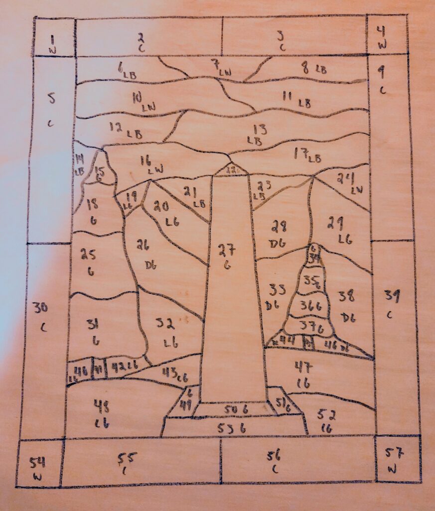
I am now at the stage with this hobby where I need to start making gifts for people in my life because I have rapidly run out of window space to (tastefully) display my pieces. A friend of mine is currently hiking the Continental Divide Trail (CDT) over the span of several months. He recently posted a photo from the starting point in Glacier National Park at the international border marker, and I thought it would be a fun moment to recreate in glass and gift to him when he returns.
Overall, creating the design was not as difficult as I expected, but it was much more time consuming than I anticipated, taking about two hours. I did need to look up some inspiration for the shapes of the trees, mountains, and sky, but the process itself was fairly straightforward.
Usually, I create my patterns by tracing designs directly from my laptop screen onto parchment paper. This time, I drew several drafts before settling on the final version. I also made sure to use a ruler to keep my lines straight and paid closer attention to keeping the border measurements even.
There were a few things I would do differently if I created this design again. Some of the smaller pieces were more fragile than I expected during cutting, and I think I could have simplified those areas. I also could have spent more time making sure the border pieces were evenly ground, as they ended up being slightly different sizes and caused the top half of the piece to slant a little to the right.
I considered using came for the first time as a border, but I just do not have the workshop space for that yet. Instead, I added wire anchors between the glass pieces, which made this piece much more secure than my previous projects when hanging.
While I am happy with the overall design, I am a little disappointed with some of my color choices, especially the sky. I think the piece ended up feeling a little flatter and less colorful than I imagined. A clear, brighter blue glass would have created much more contrast.
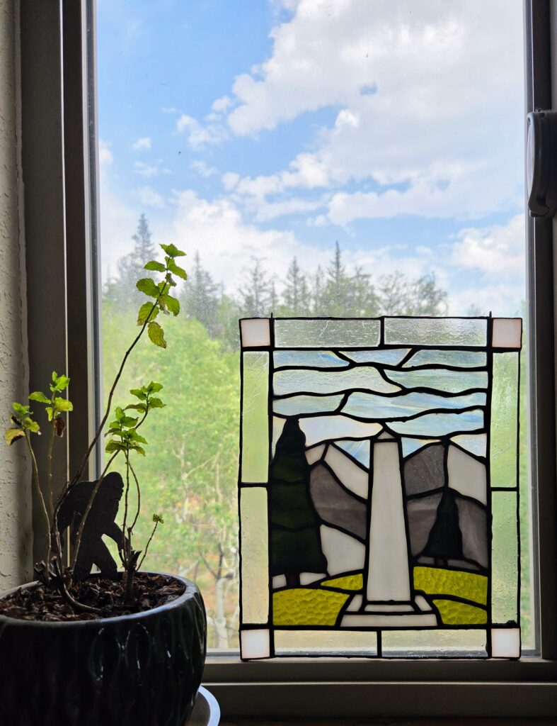
Instead, I chose a wispy white and blue glass that looked almost exactly like a cloudy sky in the store. Unfortunately, once it was hanging in a window, that texture became much less noticeable. I also used a very dark, semi opaque glass for the trees, which was both difficult to work with and did not add much additional color to the piece.
I am starting to realize that I tend to gravitate toward transparent, textured, and brighter colored glass for most of my projects. A piece of glass can look perfect when I am holding it under the lights at the store, but seeing how it interacts with actual sunlight is a completely different experience.
Looking at the finished piece, I am excited to gift it to him, even though it is not perfect. I am proud of my first original design, but I have also realized that this part of the stained glass process is probably not my favorite.
Drawing and graphic design have never been things I particularly enjoy, partly because they are skills I have never been very good at. I usually have the idea in my head, but turning that idea into a workable pattern takes a lot more time and patience than I expected. Even tracing a pattern onto my glass has been one of my least favorite parts of the process.
What can I say, I just do not like drawing.
Pingback: I Thought I Was Getting Better at Stained Glass. Then I Made This Panel. – The Lead Lines